Back in the first half of 2016, the home page team spent about six months in what we call a “Discovery Phase.” Which is basically a glamorous way to say we did a lot of research.
We wanted to learn as much as possible about our users — who they are, what they do when they come to the website and why they behave the way they do. So we ran focus groups and put intercept polls on the site. We took a deep dive into the site’s analytics. We read white papers and research findings from other universities and organizations. We did a competitive analysis where we reviewed five other university websites with a fine-toothed comb. We interviewed stakeholders from across the university. And we developed personas to help us view the new site through the eyes of our users.
All that research is informing the strategy for the new home page, and we thought users might be interested in seeing some highlights from our findings.
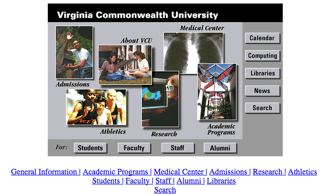
But first — want to see what VCU’s home page looked like in 1996, the year of its birth? We thought so.
Top 7 takeaways from Discovery Phase
1) Traffic to the home page has been decreasing for the past few years. We’re not sure why, but we suspect that users use the home page less and less as a portal to VCU’s hundreds of websites and instead just google what they’re looking for and find VCU websites that way.
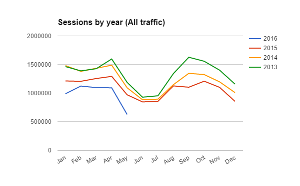
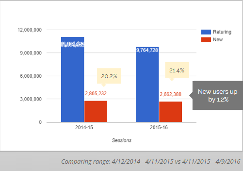
2) But the home page still gets a lot of traffic — it got 12,136,383 visits from 2,738,103 users in FY2016. On a typical day, e.g., Feb. 20, 2016, it got 47,099 visits from 30,509 visitors. And the percentage of new visitors is holding steady.
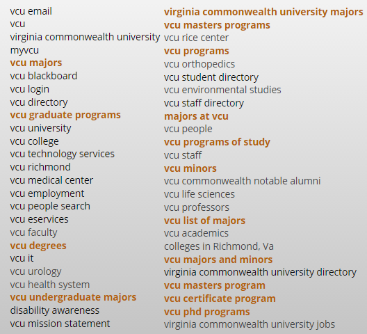
3) Prospective students are looking for academic program info. After the home page itself and the email page, the academics page by far got the most views from off-campus users. And these were the top 50 Google search terms that brought users to the home page (program-related terms are in orange):
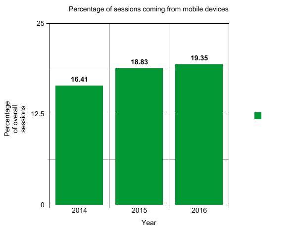
4) The percentage of mobile traffic is slowly increasing.
5) We have too many links in our navigation. Our competitive analysis showed that we have more links (~100) than all five of the sites we studied. Could this be a symptom of trying too hard to be everything to everyone (aka, kitchen sink syndrome)?
No. of links in main nav:
- University of Nevada, Reno: 20
- University of Virginia: 30
- Johns Hopkins University: 59
- Virginia Tech: 87
- Cornell University: 74
- VCU: 99
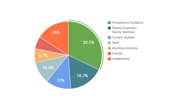
6) The home page should have one clear primary audience, and that audience should be prospective students and their families. Not only is this a trend in higher ed, but in our competitive analysis we found the sites we felt were most successful had a clear target audience. Of the nearly 1,400 people who answered our polls, nearly 50 percent were prospective students or family members. And when we asked focus groups and stakeholders from around the university who the main audience should be, the general consensus was prospective students.
Self-identified audience type from intercept poll results:
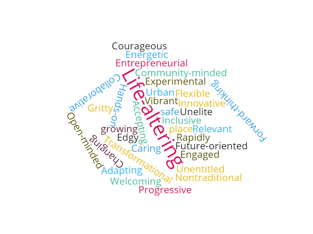
7) We heard from people via our stakeholder interviews and focus groups that some of VCU’s greatest strengths are its diversity, urban location, cross-disciplinary collaboration, community engagement and entrepreneurial spirit. These are all things we’d like to emphasize on the new site.
Words that people used to describe VCU: