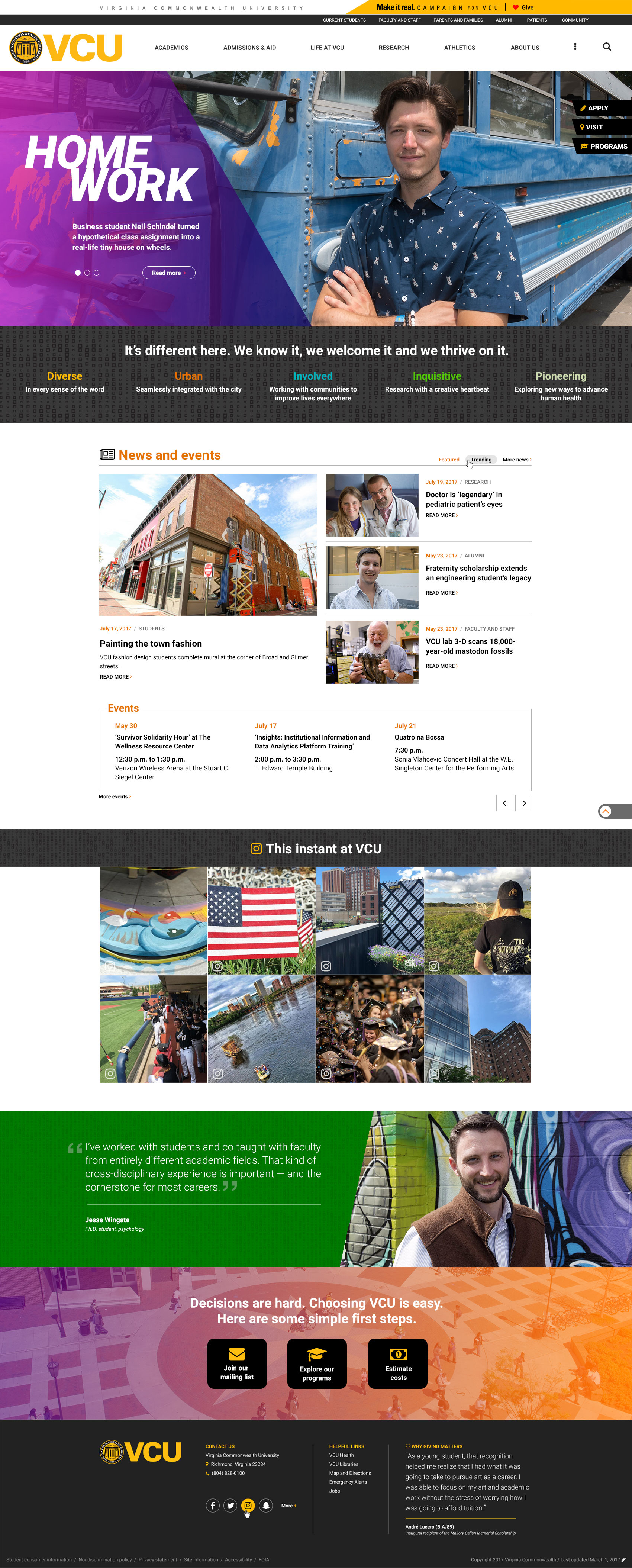
After many months (drumroll please), we’re pleased to share the design for the new VCU home page with you. Take a moment to check out the page in its entirety, then we’ll walk you through it section by section below.
And don’t feel shy about sending us feedback. The beta version of the home page is set to launch in a few weeks and we’re eager to hear what users think.
Navigation and feature area
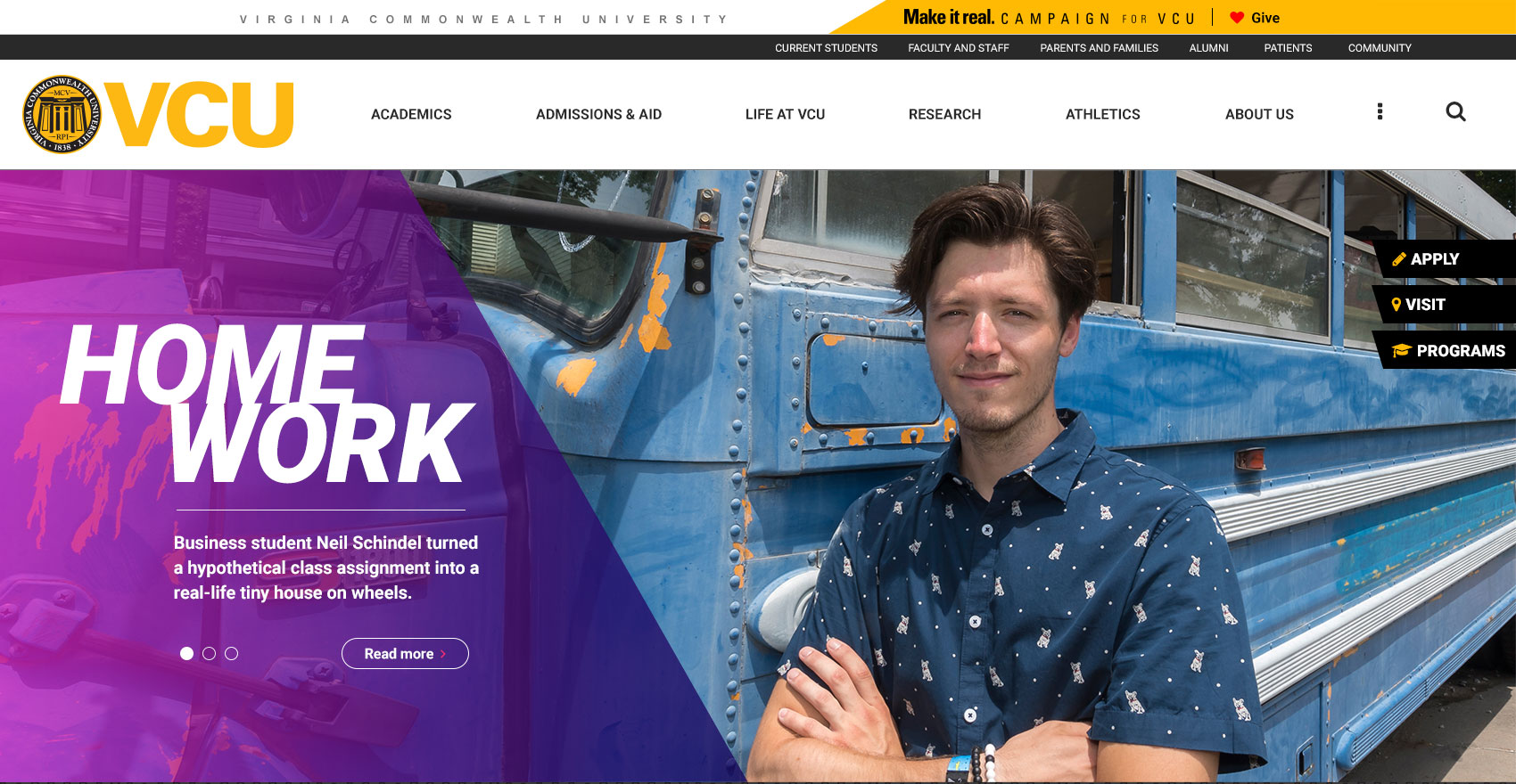
Our navigation is lighter, brighter and more streamlined than on the old site. You can read more about the navigation and the thinking that went into it in the previous blog post.
The feature slider is also slightly different. It’s larger and bolder, and the stories will be more visual. We want them to appeal to our primary target audience of prospective students and give them a sense of what life is like at VCU. And sometimes the features won’t link to stories at all — they might link to a video, or one of VCU’s social media accounts or to a subpage on the site.
On the right side of the feature slider, you’ll see three very important calls-to-action for prospective students: apply, visit and programs.
VCU in a nutshell
The section directly below the feature slider lists five keywords that sum up who VCU is. These are the qualities that set us apart from other universities and make us proud to be Rams.
News and events
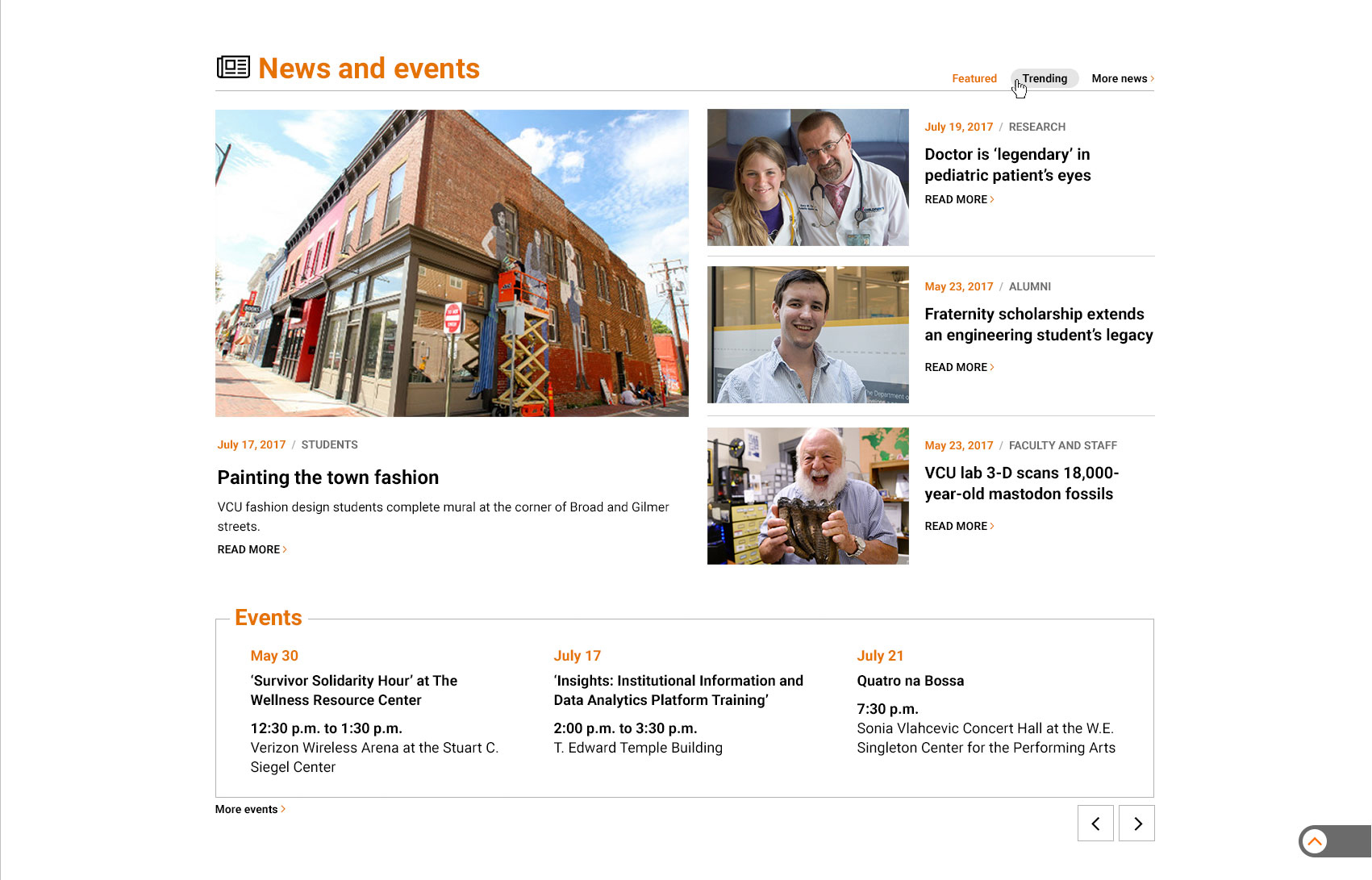
The news section features bigger, juicier photos and the chance to toggle back and forth between featured and trending stories. The event feed pulls from TelegRAM, as it does on the old home page, but it now includes the location in the listing, so that you can more easily decide at a glance whether you’re able to make it to a particular event.
This instant at VCU
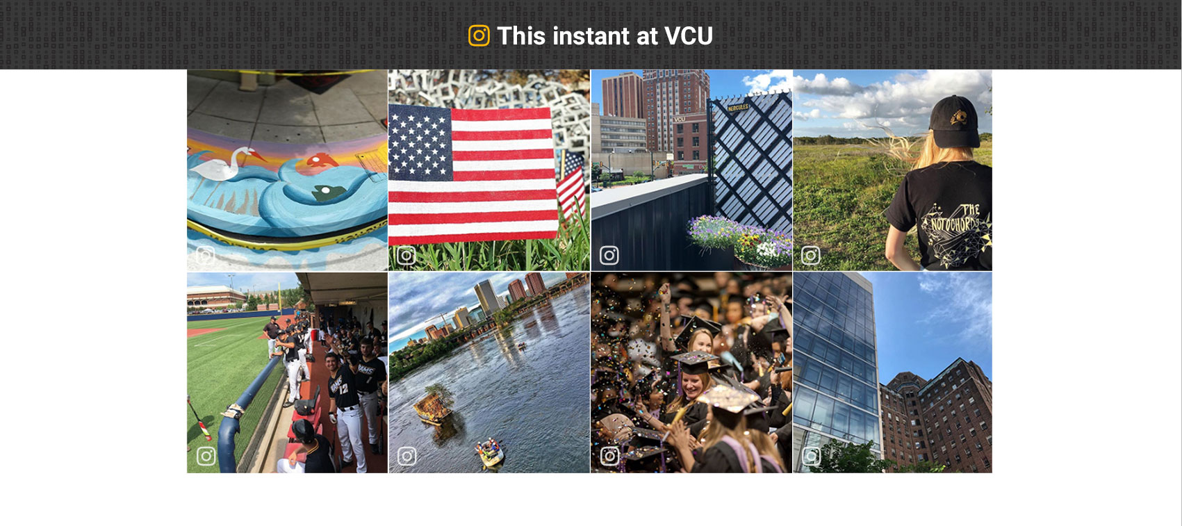
The grid of eight photos is a live feed pulling from VCU’s main Instagram account. We felt this would give a dynamic, always-changing, always fresh glimpse of life at VCU.
Testimonial
This quote from a real student gives prospective students a sense of what the atmosphere is like at VCU and helps them understand what differentiates VCU from other schools. The testimonial will change periodically to keep it fresh and provide different perspectives.
The footer
Last but not least, we have revamped our footer. It’s sleeker than the old one and includes VCU’s main contact info, social media buttons, helpful links and a quote that shows the impact of giving to VCU. This quote will change periodically and is a subtle way to tie into the Make It Real Campaign for VCU, the largest fundraising campaign in VCU’s history.


