Anyone who spends time online these days knows that finding your way around a website can be either gloriously simple or infuriatingly difficult. And whenever a site is redesigned and the navigation changes, it takes some getting used to.
That’s why we’re showing you a preview of the navigation for the new vcu.edu (click each of the embedded images in this post to enlarge for detail).
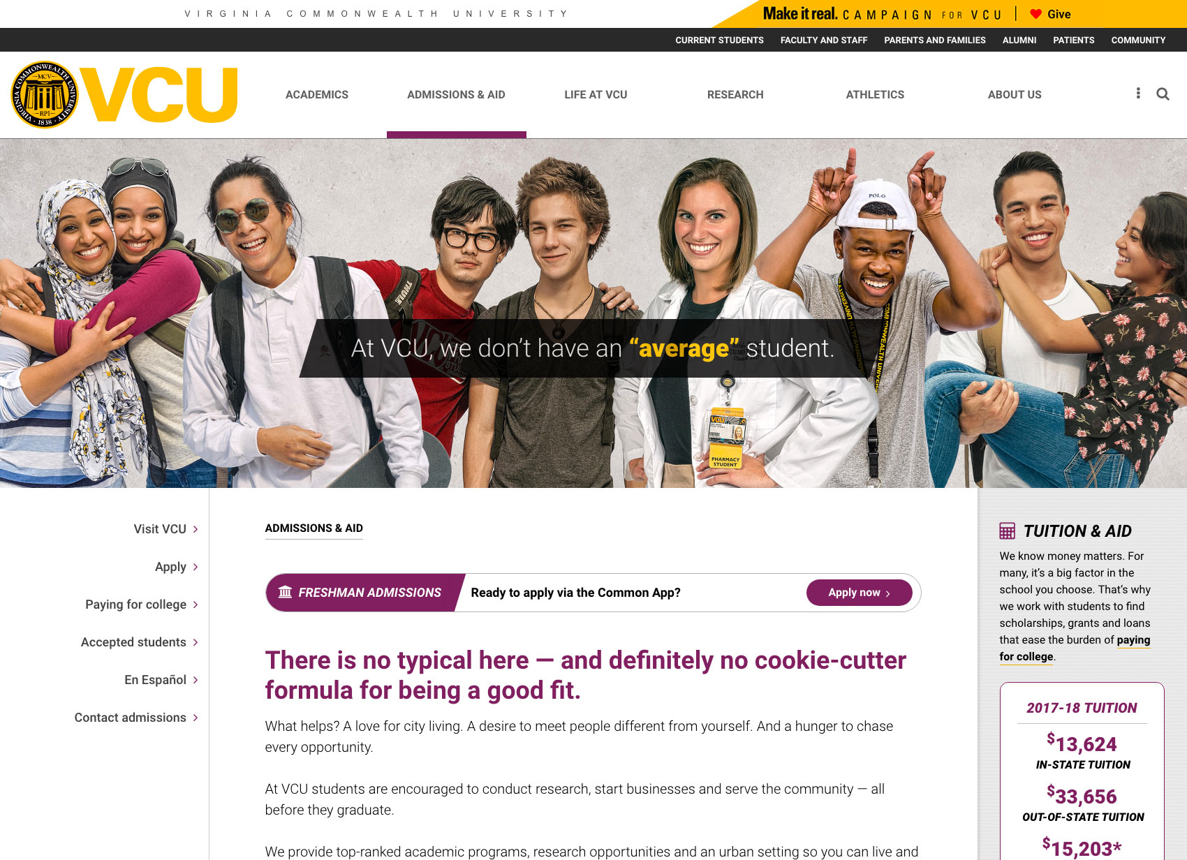
Below: This screenshot shows the Admissions & Aid subpage with the new navigation for the site at the top of the page.
Our current site has nearly 100 links in the navigation, which is a lot compared to many of our competitor sites. It’s also a lot to sift through for our target audience of prospective students and their families. As a result, we’ve streamlined the new navigation.
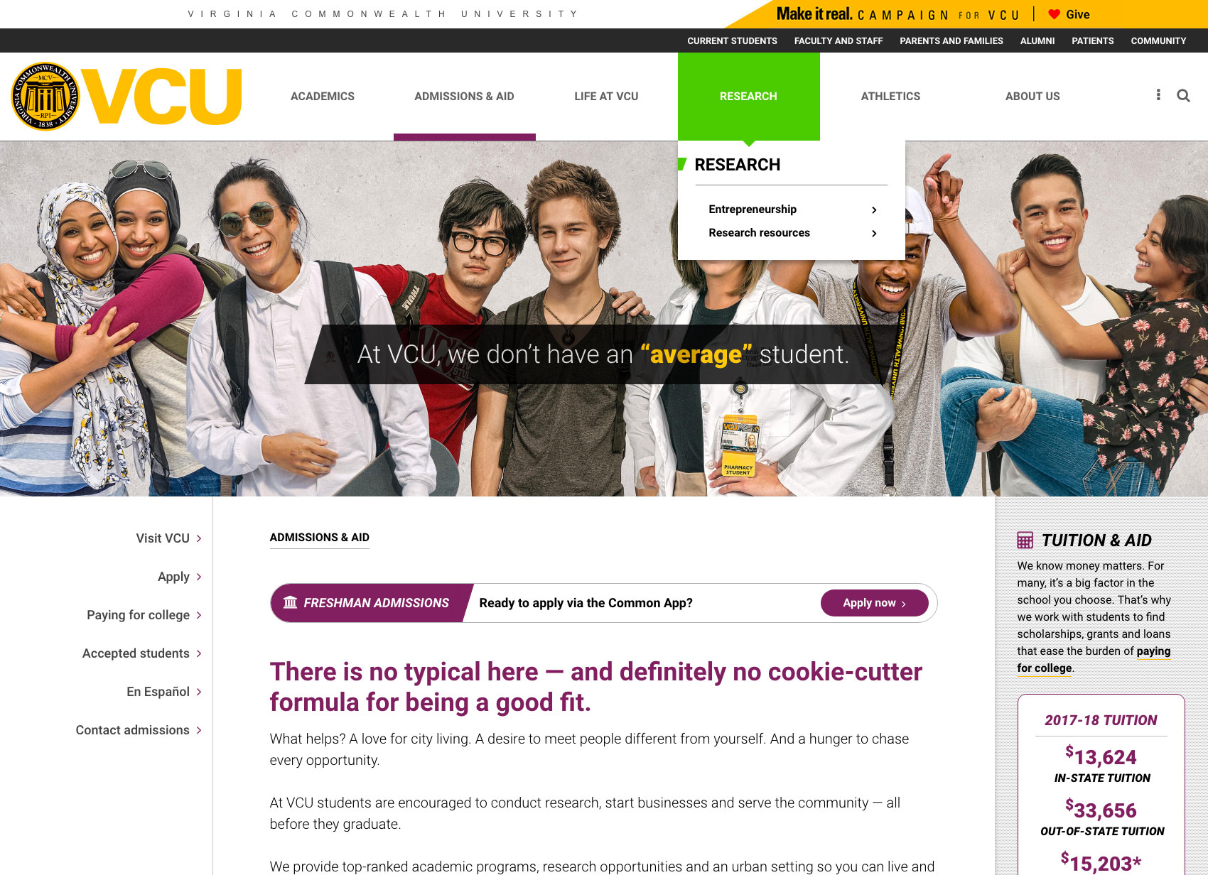
Below: This screenshot shows that when you hover over an item in the main nav (in this example, Research), you will see a drop-down menu with additional links.
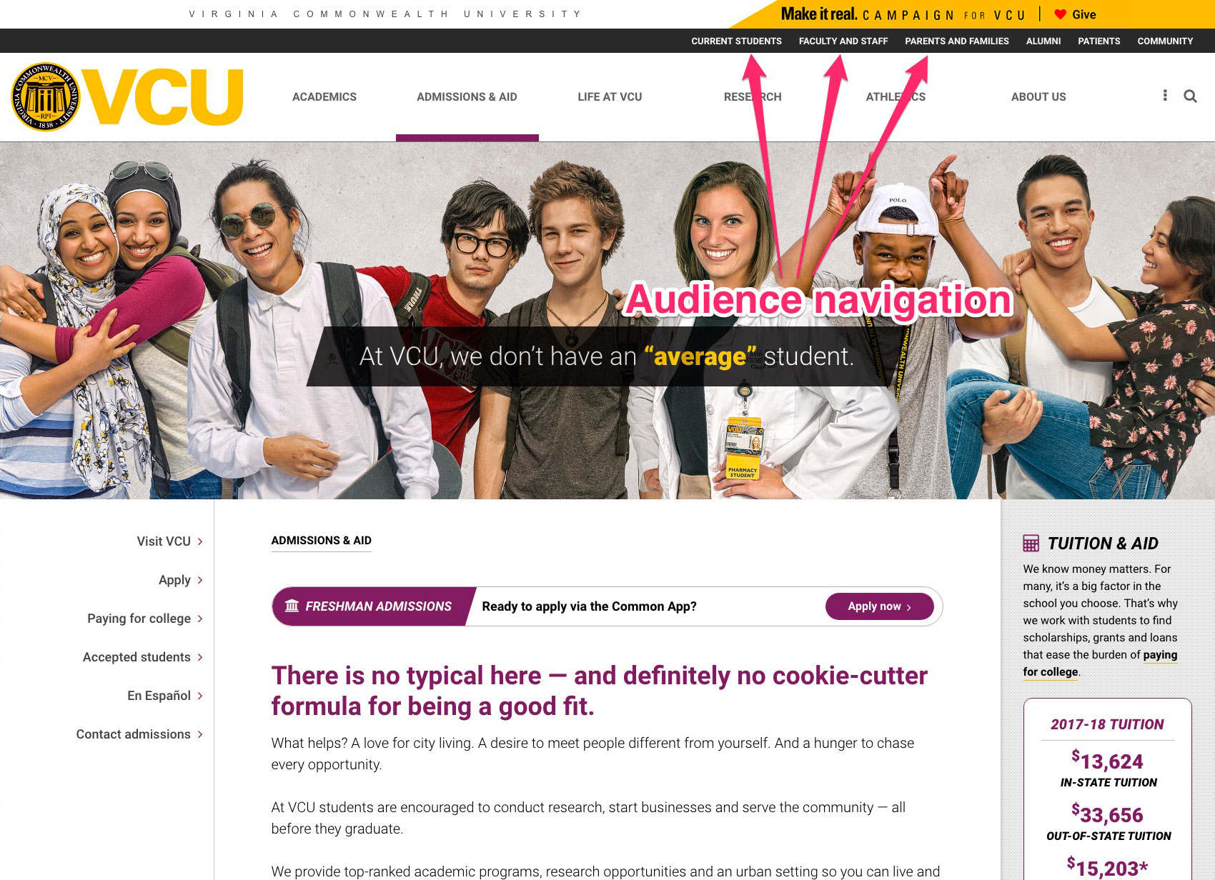
We’ve also tried to gear the main navigation (in the white strip) to prospective students while consolidating links for current students, alumni, faculty, etc., into an audience navigation (gray strip).
Below: In this screenshot, arrows point to the audience nav.
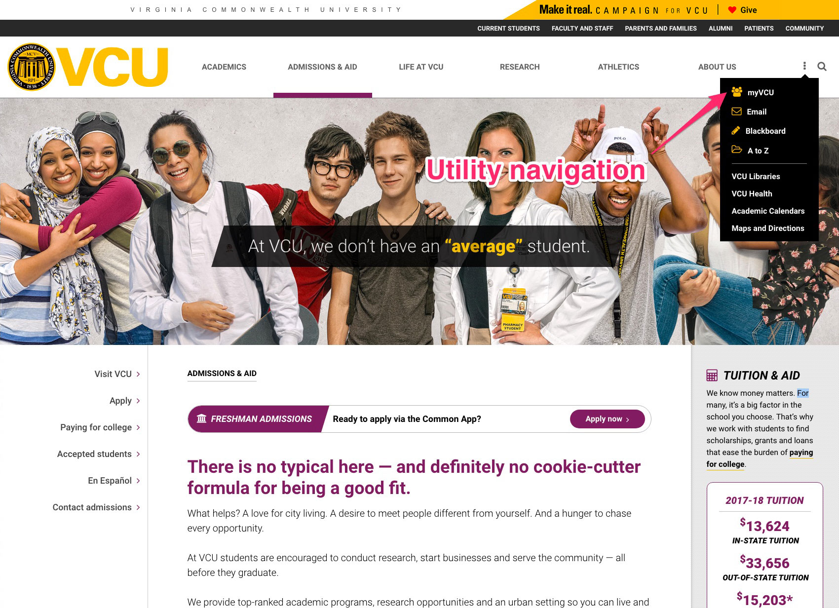
We know from our analytics that many current students, faculty and staff go to the VCU home page to get to their email, Blackboard and the myVCU portal. However, these everyday tools don’t apply to prospective students, so we’re putting them all together in a drop-down menu on the far-right of the navigation. When you hover over the three dots symbol, you’ll see popular links and tools for current students, faculty and staff. We’re calling this our “utility navigation.”
Below: In this screenshot, an arrow points to the drop-down utility nav menu, located next to the search icon.
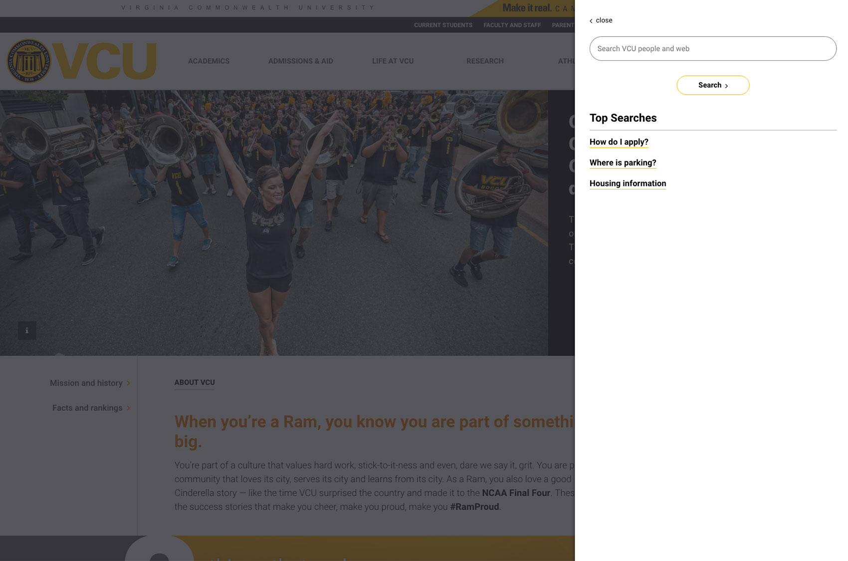
Last but not least, you’ll find the search function also in the far-right of the main navigation. When you click on the magnifying glass, a box will expand where you can type your query, but you’ll also be able to see a list of popular searches.
Below: This screenshot shows the search menu that is displayed will you click the magnifying glass/search icon located at the right-hand side of the screen.
A note about search: We’ve heard from users that the search function on the current site does not always work well. The university uses the Google Search Appliance, which is managed by VCU Technology Services, and while the GSA offers many great features, it also has limitations that are beyond VCU’s control. Google is ending the GSA in 2019, so at that point VCU will implement a new search solution. In the meantime, if you have trouble with search results, let us know. There may be some search engine optimization improvements that can be made on the back end of a particular website that will help it come up earlier in search results.
